2026-05-18
Building "Constellation"
There is a particular kind of problem that sounds deceptively simple until you actually sit down to solve it. Dating apps fall squarely into that category. On the surface, it's just profiles and swipes and a little chat window. But the moment you start pulling on the thread, you discover that every small feature is load-bearing, that every design decision ripples outward into six others, and that the thing you thought would take a weekend will still be keeping you company three months later. This is the story of building Constellation, a dating app for the polyamorous community, and how it came together from a blank repository into something people can actually use.
Why a New App at All
The polyamorous community has always occupied an awkward position in the dating app landscape. The big platforms were built around a simple assumption: one person looking for one other person, full stop. Everything from the profile structure to the matching logic to the way conversations are framed reflects that assumption. Adding a "non-monogamy" tag in your bio on a mainstream app does not change the underlying architecture of a product that was never designed with your relationship style in mind.
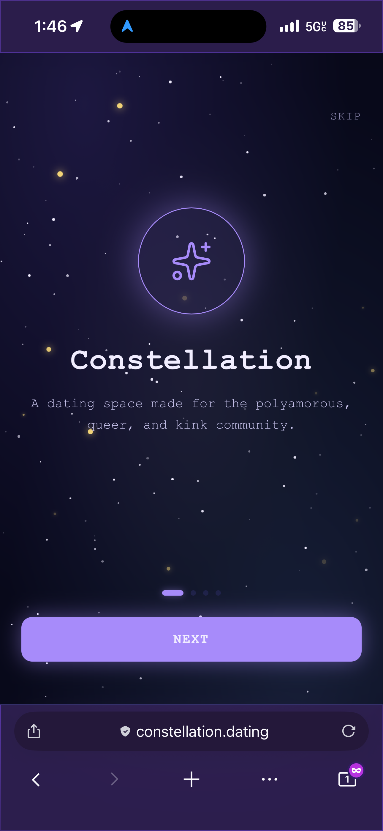
Constellation was built to fill that gap. Not just by adding a checkbox or a relationship style field, but by rethinking what a dating app profile actually needs to communicate when the person filling it out might be a solo poly person looking for a comet partner, or part of a triad looking to grow, or a relationship anarchist who rejects hierarchical labels entirely. The app needed to hold more complexity than its predecessors, and it needed to feel like it was built for that complexity rather than reluctantly accommodating it. Additionally, traditional dating apps are contradictory because the point is to meet your person, yet they are designed to encourage you to keep coming back to the app. With Constellation, it's an app that polyamorous people will, more often than not, keep coming back to because poly folks tend to continually date and expand their networks. So there's a unique opportunity to build something with a bit more purpose and less so just manipulating people into coming back to spend money... or worse, cheat on their partner.
Choosing the Stack
The decision to split the codebase into two separate directories, one for the API and one for the app, came early and turned out to be one of the better calls made during the build. The backend is a SvelteKit application running as a pure API, with no server-side rendering and no pages of its own. It handles all the business logic: authentication, profile management, discovery, matching, real-time chat, and the constellation feature that gives the app its name. The frontend is a React Native Web application bundled with Vite, which means it runs in the browser like any other web app but is written in the same React Native component model you would use for a native mobile app. We will eventually ship for iOS and Android as well, but for now we are in pure dev mode.
The database is Neon's serverless Postgres, accessed through the postgres.js driver. Real-time features, specifically the chat and the constellation request notifications, run through Pusher. Photos are stored in Vercel Blob, with a base64 fallback for local development when you do not want to be making blob storage calls every time you reload the page. The whole thing is deployed on Vercel, with the API and the app as two separate projects pointed at two separate domains.
One thing worth noting about the postgres.js driver: it requires prepare: false when connecting through Neon's pooled connection URL, which is not prominently documented and will cause silent failures if you miss it. The driver also throws if you pass undefined into a template literal, which means every optional field needs to be null-coalesced before it touches a query. These are the kinds of lessons that get learned the hard way.
Authentication Without Passwords
The auth system uses magic links, and it is simpler and better than it sounds. The user enters their email address, the API generates a short-lived token, and Resend delivers an email with a link that contains that token. The user clicks the link, the token is verified, and a Bearer token is issued for subsequent API calls. There are no passwords to forget, no reset flows to build, no OAuth dance to orchestrate.
During local development, the API returns the magic link directly in the JSON response, so you can click it in the browser without needing an email client. This is the kind of small quality-of-life detail that makes the difference between development being a pleasure and a grind.
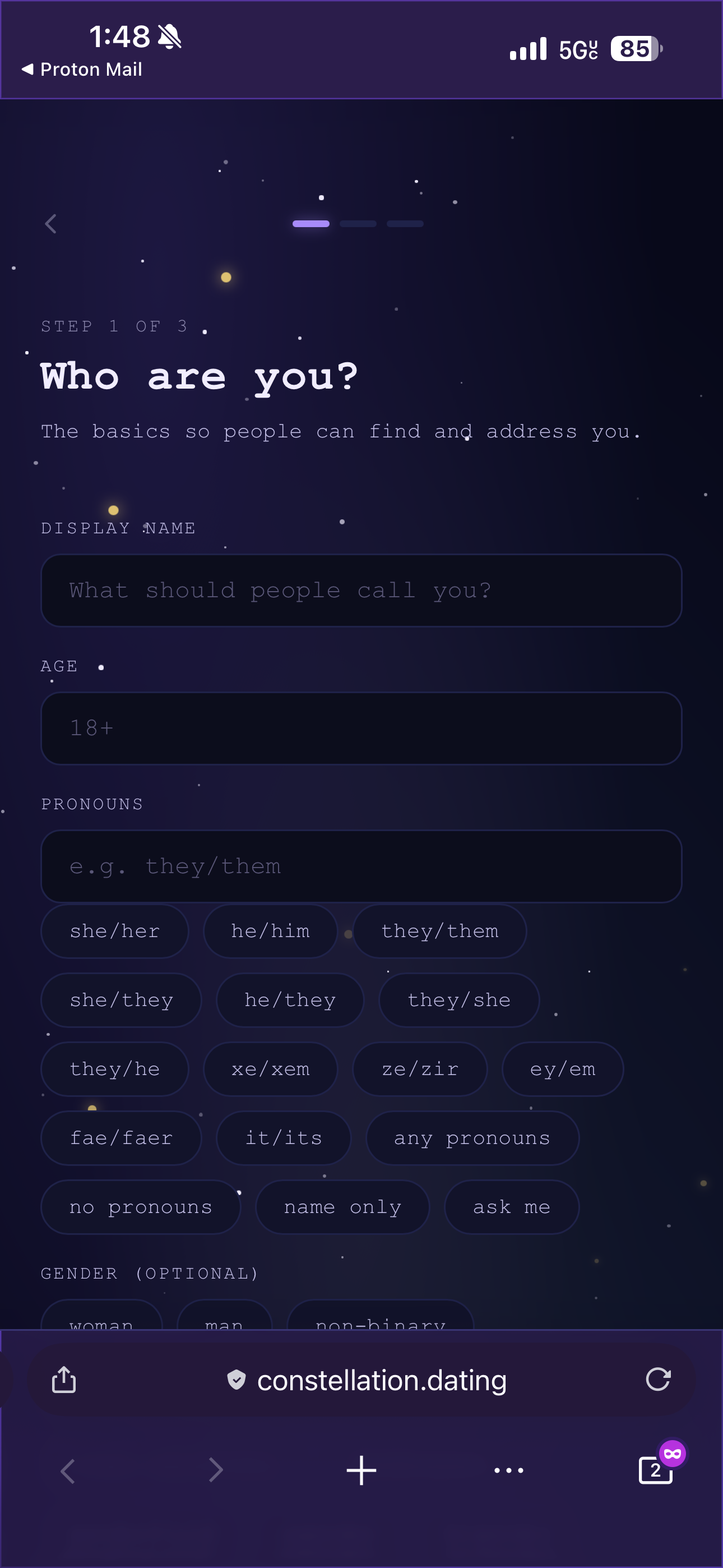
Once authenticated, new users are routed into a three-step onboarding wizard before they can see anything else. The first step covers identity: display name, age (with a hard 18+ enforcement), pronouns with a set of quick-pick chips for common options, optional gender, and an optional zodiac sign that can be deselected by tapping it again. The second step covers relationships: sexual orientation as a free-text field with suggestion chips, and relationship style as a multi-select list. The third step is the profile itself, requiring at least one photo, with a location and a bio.
The profile completeness check lives in a ProfileProvider context that wraps the entire app. When a user saves the final onboarding step, the provider re-fetches the profile and automatically navigates into the main app without requiring an explicit navigation call. It is one of those small architectural decisions that makes the user experience feel seamless even though the underlying mechanic is fairly straightforward.
Identity at Scale
One of the things that became clear very early in the build was how much vocabulary the polyamorous, queer and kink community uses that mainstream apps simply do not have room for. The orientation list alone runs to twenty options, covering not just the familiar terms but also demisexual, graysexual, biromantic, demiromantic, fluid, and several others. Gender runs to eighteen options. Relationship style covers twenty-two, including terms like kitchen table poly, parallel poly, garden party poly, hierarchical and non-hierarchical, solo polyamorous, and relationship anarchist. It's important to have a comprehensive list of these terms so that users can express their identity accurately without being limited by the app's vocabulary.
All of these lists live in a single constants file that is shared between the onboarding wizard and the profile editing screen, so there is one canonical source of truth and no risk of the two coming out of sync. Both orientation and gender are free-text fields with the chips as suggestions, which means users whose identity does not appear on the list can still express it accurately rather than choosing the nearest approximation and hoping for the best.
The pronoun suggestions alone cover sixteen options, including neopronouns like xe/xem and ze/zir, and meta-options like "any pronouns," "no pronouns," and "ask me." Getting this right matters because it signals to the community that the app was built by people who thought carefully about who would be using it, rather than treating it as an afterthought. So the UI trade-off is significant.
Discovering Other People
The discover screen is where most dating apps live or die, and the implementation here is deliberately straightforward. Users see profiles one at a time, with a photo carousel inside each card that lets you tap the left or right half to move between photos (swiping will be added later). Distance is calculated using the Haversine formula run directly in SQL, and an "online now" badge appears for users who have been active within the last ten minutes.
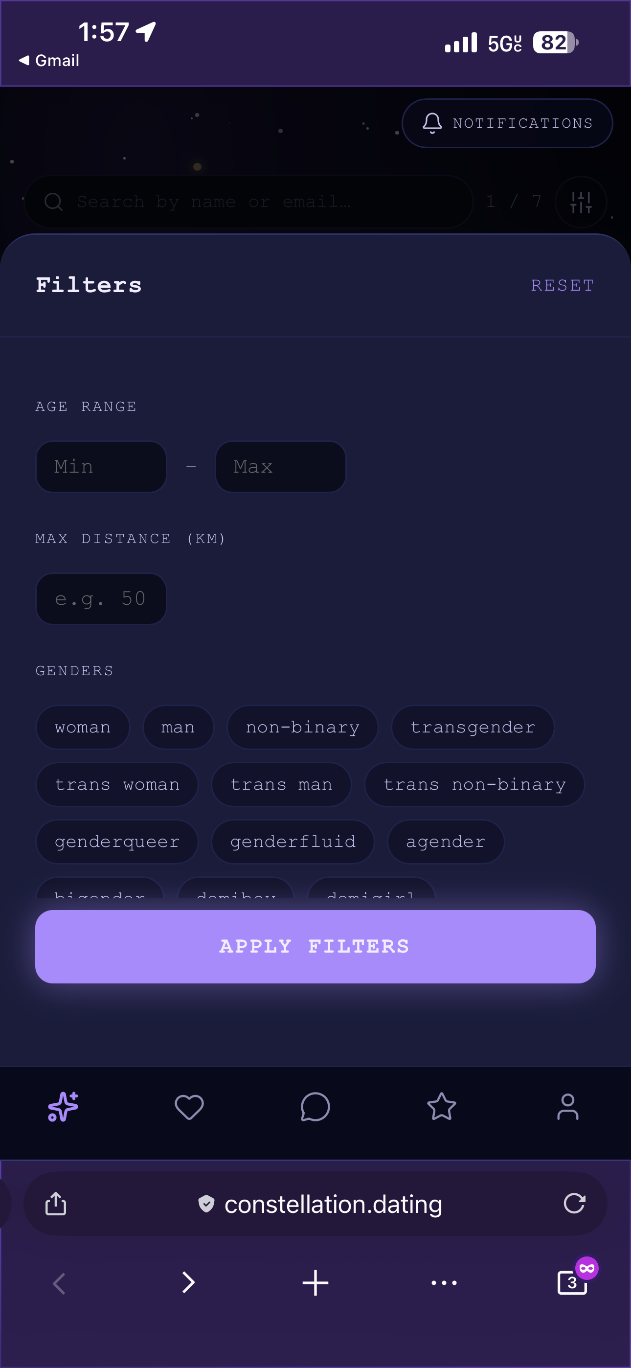
The filter panel lets you narrow by age range, maximum distance (only shown when location permission has been granted), gender, sexuality, and online status. Profiles that have been inactive for thirty days are hidden until the person logs in again, which keeps the pool fresh. Profiles you have passed on are hidden for thirty days before cycling back, unlike the permanent swipes on some other platforms.
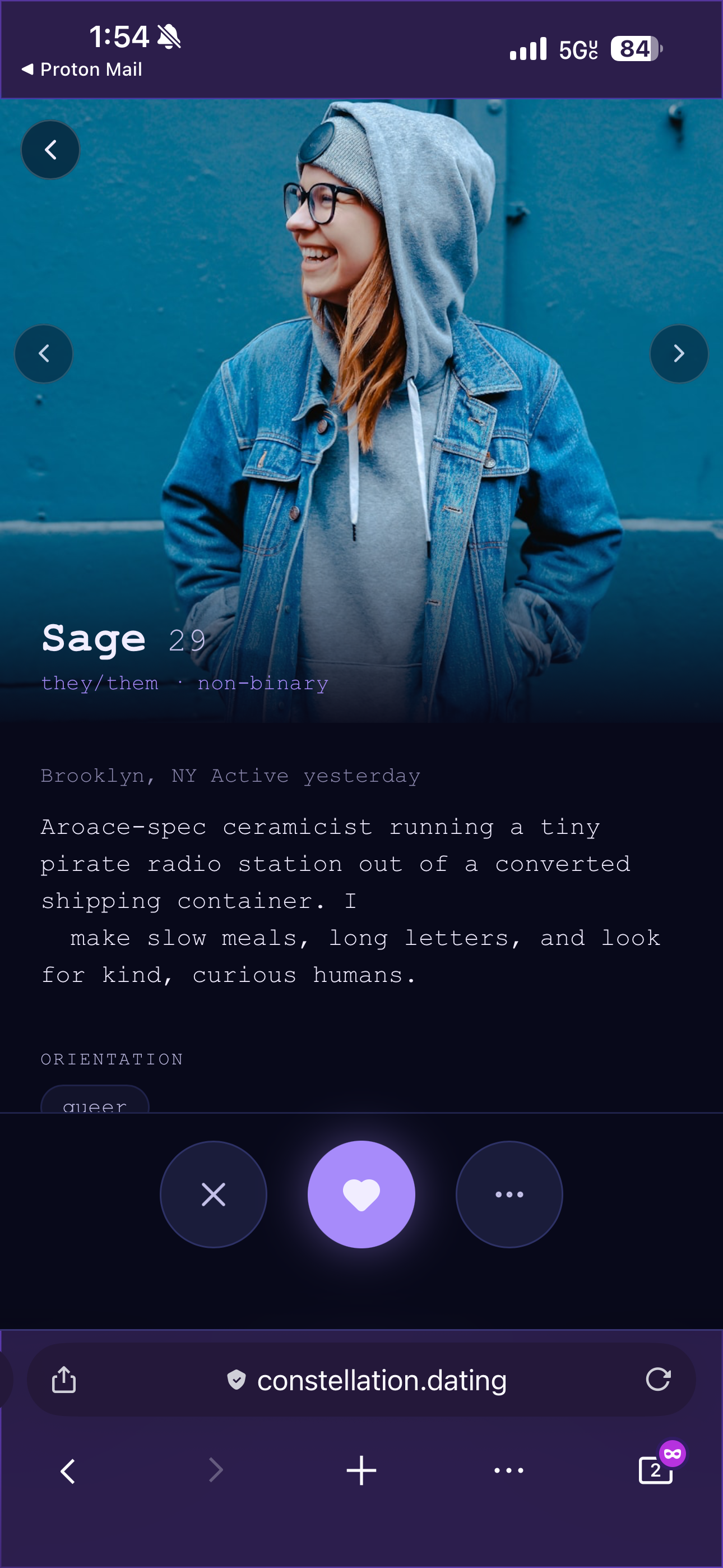
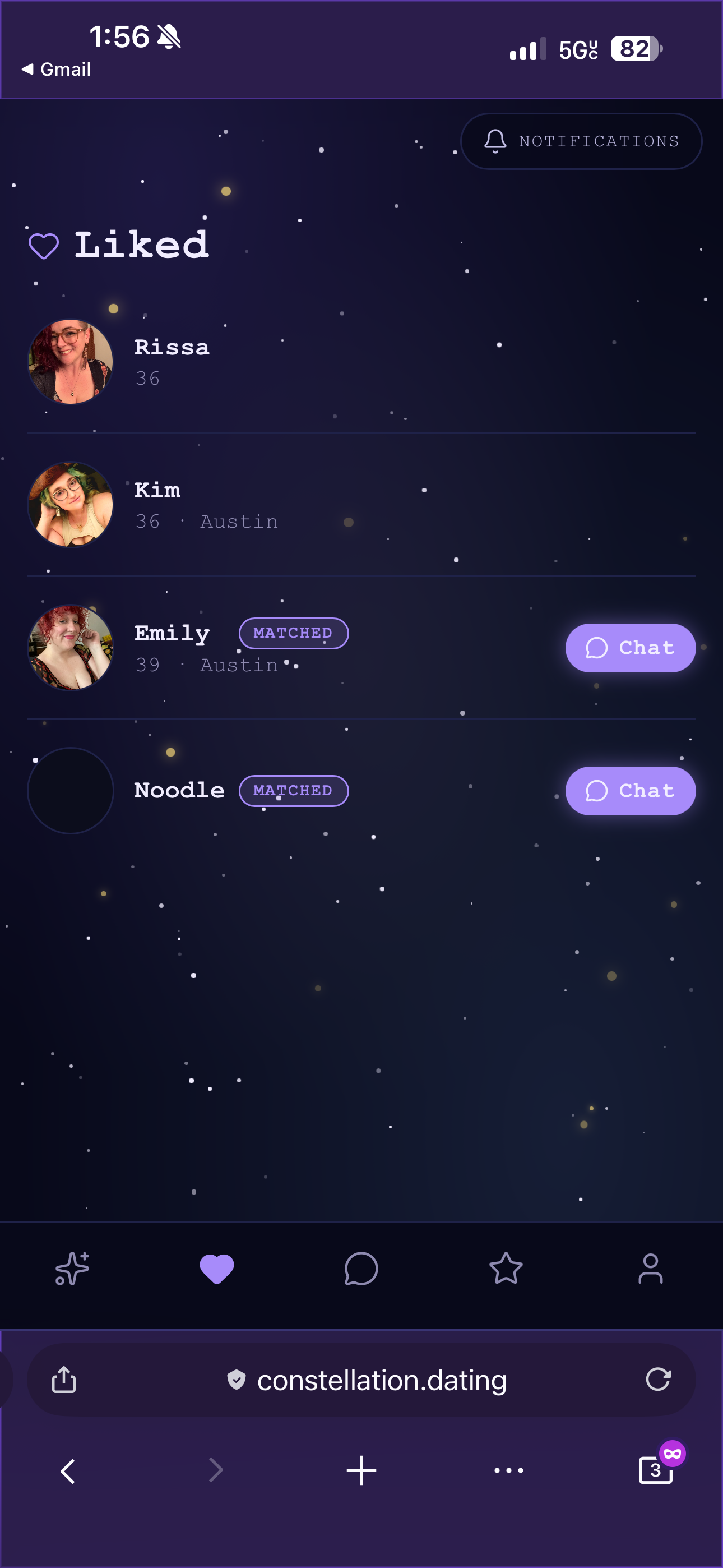
When you like someone and they like you back, a match banner appears. Profiles you have already acted on get a "Liked" or "Passed" badge for the rest of the session, so you can navigate back through the stack without losing track of what you have already done. There is also a full profile expand button, a frosted-glass pill pinned to the bottom of the card, that opens a full-screen modal with a larger photo carousel, the complete bio, and all the relationship and interest tags laid out properly. The modal has its own Like, Pass, and Report actions so you can act directly from the expanded view.
Matching and Messaging
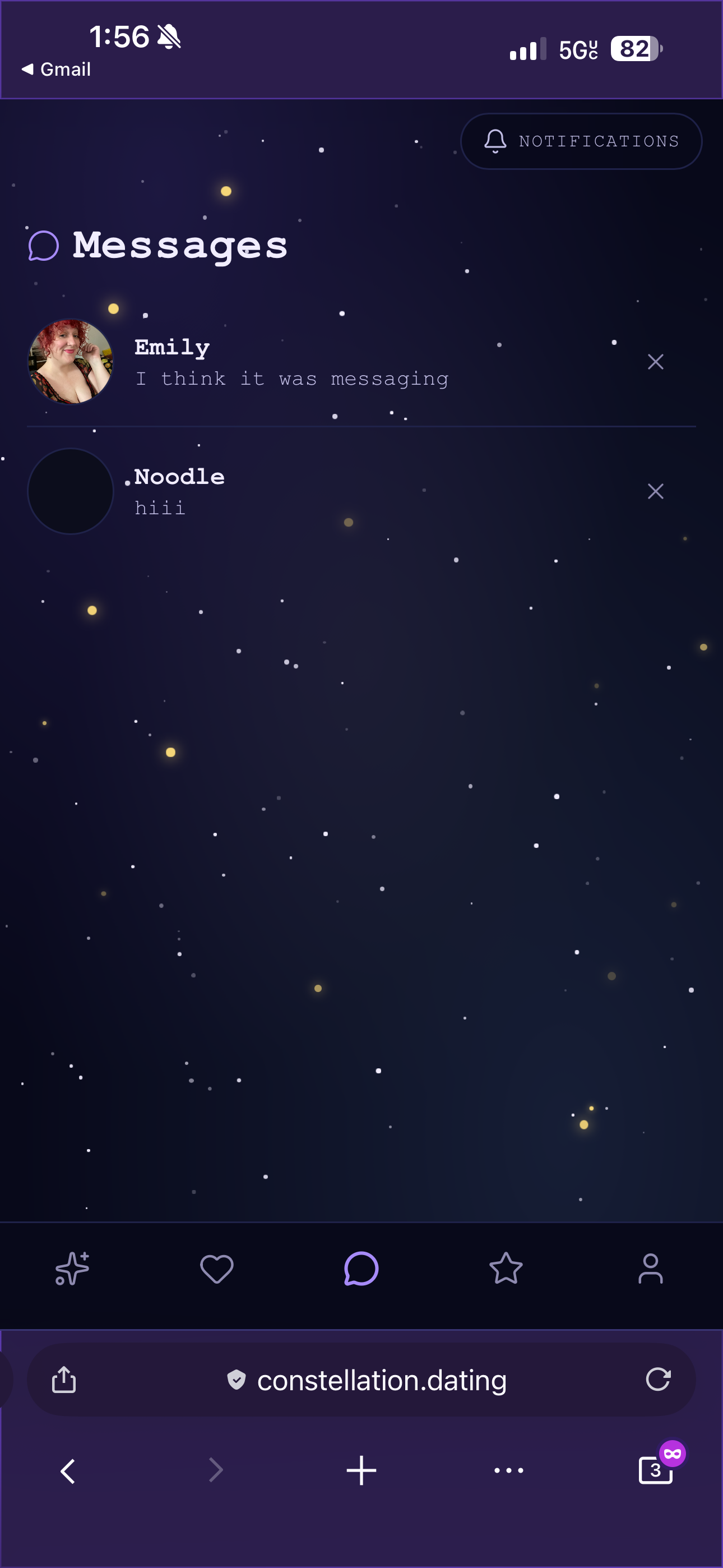
When two people have liked each other, they appear in each other's matches grid. Tapping a match opens their profile, and from there you can navigate straight into a chat conversation. The messages tab lists all matches including those with no messages yet, with a "Say hello" preview for conversations that have not started. If you want to dislike someone, it will ask you if they are your ex, if you've matched before or if they just aren't your type. If you tell the app they are your ex or you've matched before, you won't ever see that person again in your feed for privacy reasons and they won't see you in their feed either.
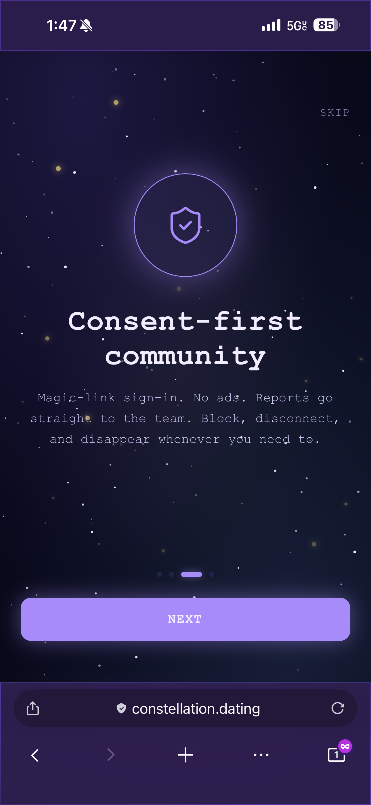
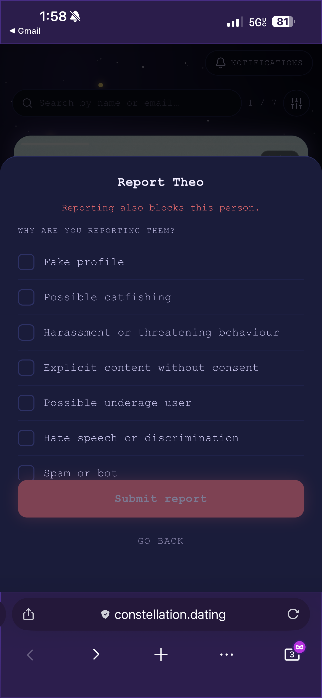
There's also a block and report UI to further assist with privacy and security for the user.
The chat itself runs over Pusher private channels and uses optimistic sending, meaning your message appears immediately in the conversation with a small spinner rather than waiting for the server to confirm receipt. If a send fails, the bubble turns red and a "Retry" link appears inline. Read receipts show a single checkmark for sent messages and a double purple checkmark when the other person has read them, and this can be disabled per-user in the privacy settings for people who prefer not to have their reading habits tracked.
Unread conversations in the messages list show a glowing purple badge with the count, and the sender name is highlighted in the accent colour so you can see at a glance what needs your attention. I chose to avoid traditional red or yellow badges to lean away from dark patterns of unseen notifications causing anxiety in the user.
What Comes Next
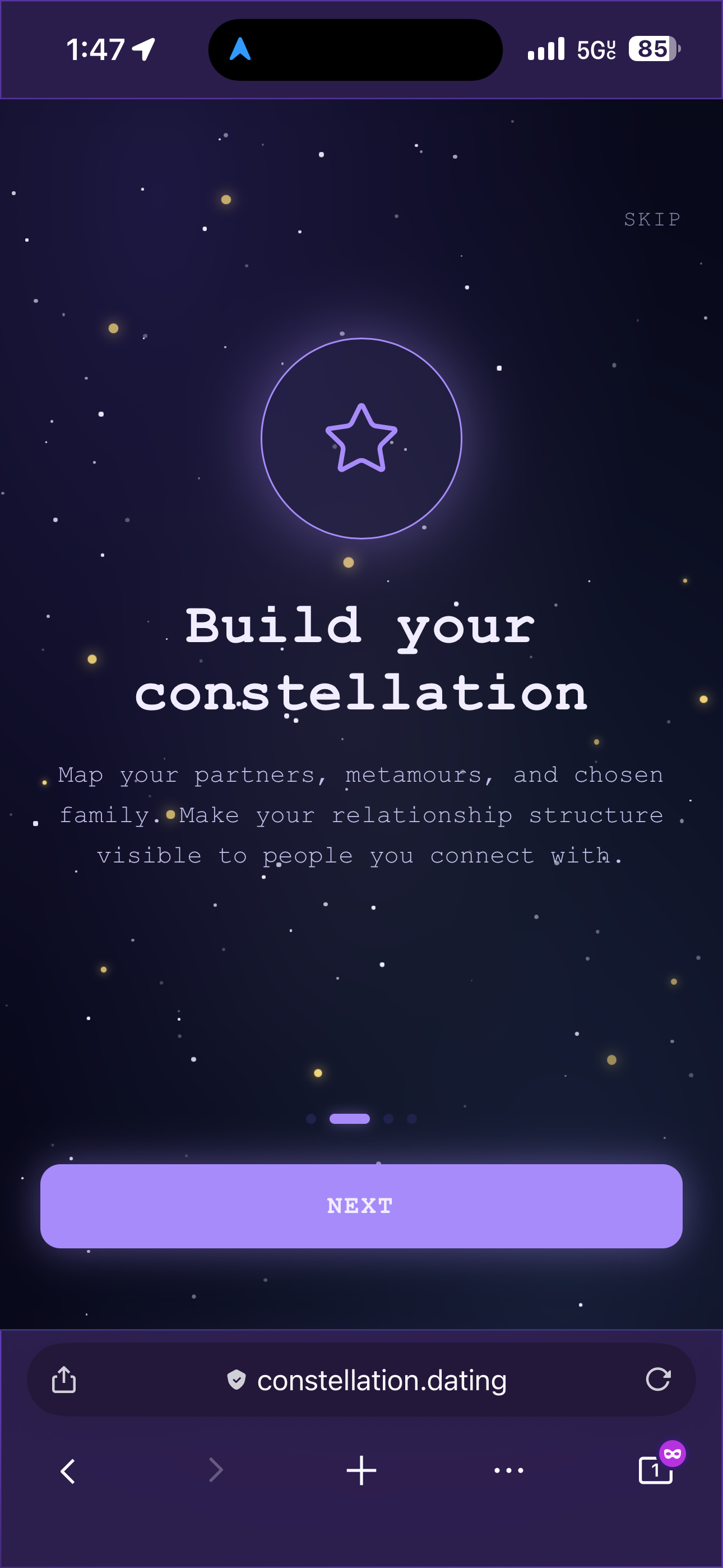
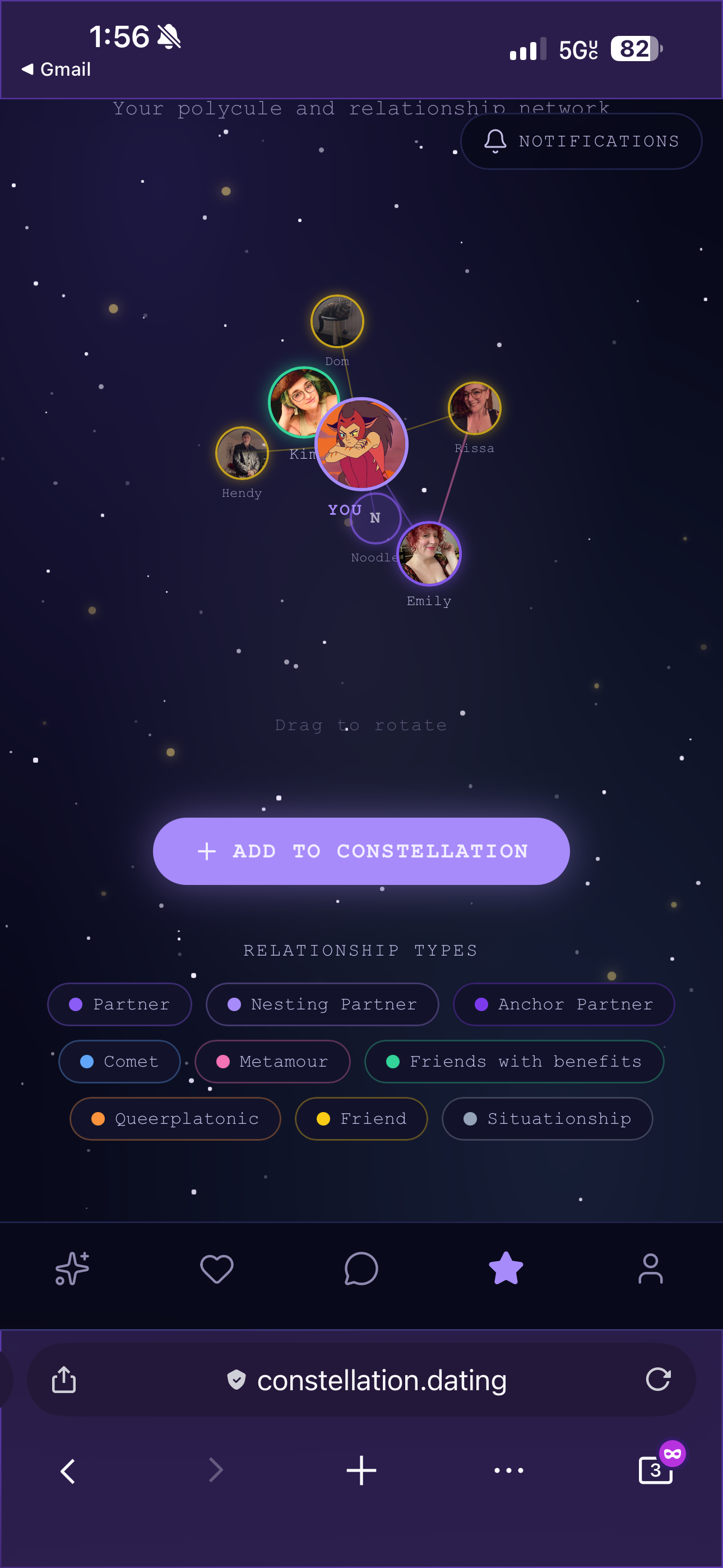
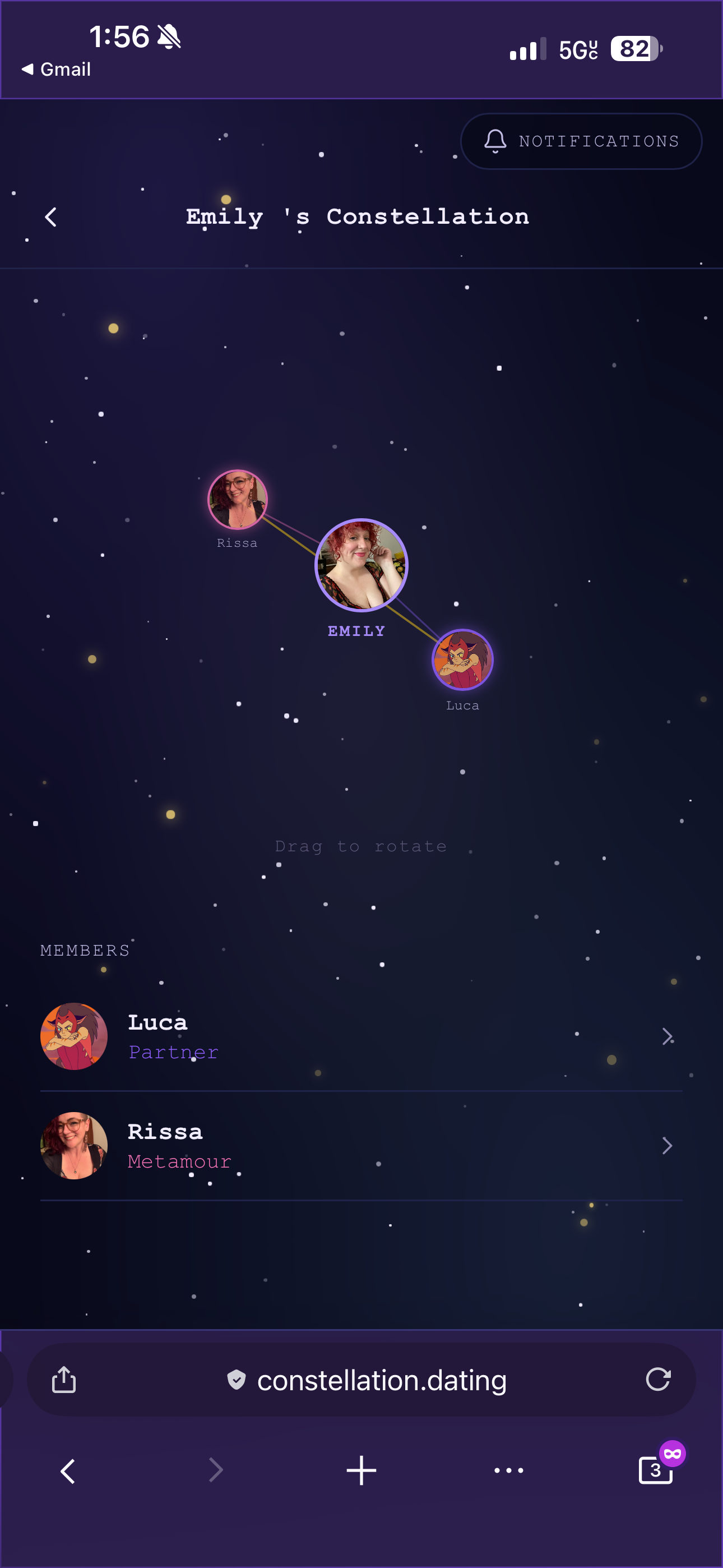
This is part one of what will be a longer series. The features covered here, authentication, onboarding, identity, discovery, and messaging, form the foundation. But the most interesting and technically challenging piece of Constellation is still to come: the constellation feature itself, a three-dimensional rotating graph that visualises a user's entire relationship network, with real-time connection requests, inter-member edges drawn from mutual relationships, and a full approval and notification system. That is a story that deserves its own post. It's barebones has been built, but it needs a lot more work.
The short version is that it is built with hand-rolled 3D projection math, golden-angle sphere distribution, RAF-driven rotation, and SVG lines cast as any to get around React Native Web's type checker. It is one of those features that looks simple in a mockup and turns out to require a significant amount of thought to make feel right.
Part 2 coming soon.